Slice & DICE: Evaluating the Leading Events & Ticketing Platform in NYC
TEAM
Solo Researcher & Designer
WHAT I DID
Evaluated heuristic evaluations from 4 experts to recommend design solutions.
DURATION
April 2024 / 3 weeks
SKILLS
User Research / Heuristic Evaluation / UX Design / Content Strategy
What is DICE? 🤔
DICE: Your go-to app for discovering and buying tickets to live events
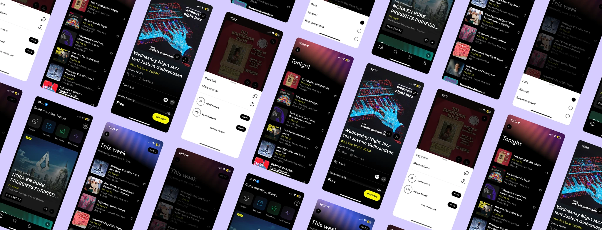
DICE is one of the leading mobile applications for events and ticketing. Popular in big cities such as New York, DICE connects fans with artists, venues, and events seamlessly, and creates a singular platform for tickets and reservations, as well as community building.
Why DICE? 🎲
The difficulties of a good interface…
The challenge
How efficient are DICE's functions?
In New York City, young adults use the DICE app to quickly find and buy tickets for events, often seeking affordable or free options. I wanted to understand how well DICE meets these needs. Therefore, I evaluate how effectively DICE supports easy navigation, event search, filtering, sharing, and seamless ticketing to ensure a smooth user experience. My areas of focus were:
01
Browsing and search features for finding preferred events
02
Sorting and filtering curated event lists according to preferences
03
Sharing events with community and friends
04
Seamless viewing and ticketing for an event
The solution
We identified and prioritized several critical issues
After identifying 10 usability issues through heuristic evaluation, I prioritized them based on severity and the number of heuristics violated. The following were deemed the most critical issues:
01
Improve discoverability by expanding the Sort By feature on Events List pages
02
Differentiate between the Share and Invite features to encourage community building
03
Standardize event labels for improved browsing
So how did I do it? Let’s start from the beginning!
Choosing the research method
Why heuristic evaluation?
Heuristic evaluation is a common UX method using guidelines (heuristics) to identify usability issues. This study applied Jakob Nielsen’s Ten Usability Heuristics to assess DICE’s interface.
Chosen for its speed and efficiency, this method relies on expert feedback rather than user testing, allowing for quick identification of issues and actionable solutions. Therefore, this method was ideal for a short evaluation sprint of DICE.
After exploring DICE’s iOS interface and choosing the appropriate research method, I set goals to identify browse and search issues, understand their impact, and propose solutions for better usability.
Key insights 🗝️
The expert opinion: Key insights from our evaluators
Each evaluator independently assessed DICE’s interface using Nielsen’s 10 Usability Heuristics, identifying usability issues, explaining how they violated heuristics, and assigning severity ratings to prioritize them.
I then compiled and summarized these findings (seen in the image below), including problem descriptions, violated heuristics, and average severity ratings. By analyzing expert feedback and recurring patterns, I identified key pain points, which guided the development of effective solutions.

Our recommendations
01: Improve discoverability by expanding the sort-by feature on list pages
Pain point
The Sort By option provided by DICE is crucial to the user’s browsing of events offered. A critical issue encountered was with the limitations and inconsistencies of the ‘Sort By’ feature on DICE’s events list pages.
Solution
The function should include all sorting options that could be helpful to the user. The proposed solution for this standardizing the Sort By feature across all list pages.
If a page does not allow for sorting by content, include the feature, but disable unusable options. Additionally, provide for sorting by price to add another layer of browsing for the user.
02: Differentiate between the share and invite features to encourage community building
Pain point
The Share/Invite feature for individual events is a crucial function for community building and engagement on DICE. However, we noticed that there was a duplication in function with these features. As you share events, DICE also has some features where users can follow each other.
Solution
Our recommendation would be to separate the two features, making the Invite feature more formal and only for the DICE community, while the share feature helps send events to friends and more.
03: Standardize event labels for improved and focused browsing
Pain point
DICE’s event labels are important for recognition of event type. They play an important roll right from the Home Page in enhancing event browsing according to user preferences. We found an inconsistency in these labels and those attributed to individual events that may hinder usability.
While “gigs” is a common colloquialism used in the world of events, it is an ambiguous label for categorization in DICE. The label shows up in isolation on event specific pages only, therefore making user wonder what the label means.
Solution
Standardization of labels is extremely important for DICE’s interface. Our recommendation is to fold events with the label “gigs” into the category Shows to provide standardization and consistency across the interface.
Reflecting on what I learned
Choosing an appropriate research method is so important! ✅
Heuristic evaluation is just one of many effective usability testing methods. Choosing the right evaluation approach for a project is essential, and justifying that choice is a skill that improves with experience. As I continue to grow, I aim to make more informed and confident decisions in selecting the best methods for each challenge.
Getting better at writing and synthesis ✍🏽
Synthesizing a project into a clear and compelling report and case study is a skill that improves with practice. Both UX writing and effective communication are areas I am continuously developing. This project challenged me to present its story in a unique and engaging way, pushing me to think creatively. I look forward to refining these skills further.
The power of high-fidelity mockups 💥
Implementing my proposed solutions into high-fidelity mock-ups transformed abstract ideas into visual solutions that communicated ideas seamlessly and were immediately understandable. This process revealed how minor design decisions influence usability. In design, showing is ultimately more powerful than telling.
Appendix
Project Report
As part of the project, I wrote a usability report that details our strategy, process, findings, and recommendations thoroughly, as a reference for DICE.